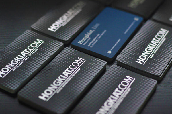
Business Card Design: 7 Essentials To Consider
Within the first 10 seconds, your potential client is building up a lasting opinion about you.
It sounds harsh but it’s a fact that people often do judge a book by its cover, and you only get one shot to make a great first impression.
Fortunately there are a few tricks you can pull off, such as diverting their attention from the fact that you forgot to iron your shirt by pushing a unique and beautifully designed business card under their nose.
It’s always a great idea to carry some self-promotional material in your pocket, whether you’re attending a conference where networking is key, or for instances when you bump into an old friend who is now a possible business partner. Having said that, card should also be designed well enough to leave a good impression. Below is a list of essential tips to keep in mind when designing the perfect business card.
1. The Issue Of Size And Colour
. The most common card size is 90 mm x 55 mm, so the best document size to work on is 1039 x 697 pixels; remember that you need to take Bleed (more on this after the break) into account. Ensure any images you use are at least 300dpi for a high quality result. It’s a good idea to work in CMYK colour mode as opposed to RGB. CMYK stands for Cyan, Magenta,Yellow and Black (Black is known as Key), and is used in colour. CMYK is a subtractive colour model, which works by masking colours on a light or white background, reducing the amount and colour of the light that is reflected by the paper.

The display you are using to read this article adopts an RGB or additive colour model, mixing Red, Green and Blue to create the majority of the visible spectrum, and combining all three to create white. While some designers prefer to design in RGB, be sure to preview it in CMYK as some of your chosen colours may appear fine on screen, but ‘muddy’ when printed.

Unless your design background colour is white you need to prepare the Bleed area for your card design. Preparing the Bleed (yes, it sounds like a heavy metal band) involves highlighting an area surrounding the document, usually 3 mm thick (this may vary depending on the printing company) with the same colour as the background colour of your card design. This prevents any ugly border strips from turning up on the edge of the cards.

In fact, it’s best to try to avoid using borders on your business card designs at all. They may look good, but when the cards are cut, you will most likely have some ‘lop-sided’ edges. All printers have a margin of error for cutting your cards, which can be as much as a few millimetres, so expect some variance in the area where the blade falls. What you see on screen:

What you may receive:

Notice how the the borders disappear when the blades do not cut at the right places? A few millimetres can make all the difference to your card design.
Choose colours that are aesthetically pleasing. A mish-mash of bright and bold colours may make your card stand out in a stack of 50, but it could be for the wrong reasons. It’s also worthwhile to think beyond your business cards: try to keep your colour scheme consistent throughout your media (website, twitter, email signature) to develop a professional image of yourself.
 There are plenty of tools available on the Web to help you create the perfect scheme. COLOURlovers is a community-driven website where people can create colour palettes and allow others to vote and comment on them. It’s a great source of inspiration, with some impressive tools to boot.
This is a pretty vital (nd sometimes overlooked) element in business card design. You wouldn’t want your clients to have to strain their eyes to read your website address or email. Make sure your text is at least 8 pt, in a clear readable font and in bold colour. Anything smaller than 8 pt may look fine on your monitor, but may be printed as a fuzzy, smudged-out line. You could also try to accentuate your name or important contact information by making it slightly bigger or bolder than the rest of your information.
6. Include Important Information
Make sure you include all the information on the back of your card that you think the client would find useful. We’ve provided a quick checklist, but you may have other things you want to throw in as well.- Your name – Put the name your contacts know you by.
- What you do – Remember to include what you do or what defines your job scope. Include the organization you are currently attached to if you wish.
- Contact information – Phone number, e-mail, work address, social media profiles etc.
- QR Code – QR codes are a great way to visually present web addresses, phone numbers or vCards. There are plenty of free QR code generators on the Web to help you with this.
- Make sure all text is embedded or outlined
- Don’t forget to remove any guidelines or colour scheme blocks
- For best results, save your design as a vector based PDF, to ensure crisp lines and high print quality
- Saving them in JPEG or PNG may result in fuzziness around edges and text